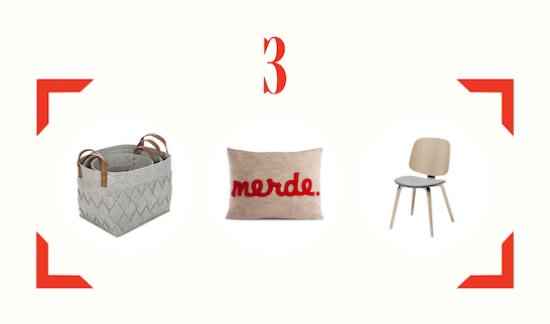
Find Love Buy logo

LOOKS YOU'LL LOVE
LOOKS YOU'LL LOVE
LOOKS YOU'LL LOVE
LOOKS YOU'LL LOVE

SHOPPING

LOOKS YOU'LL LOVE

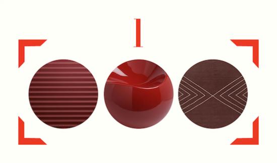
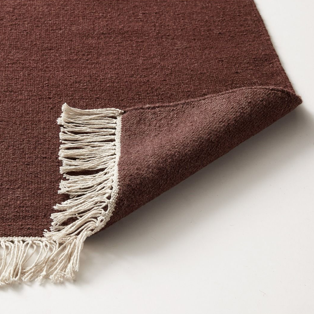
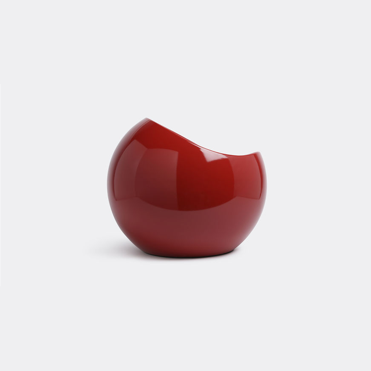
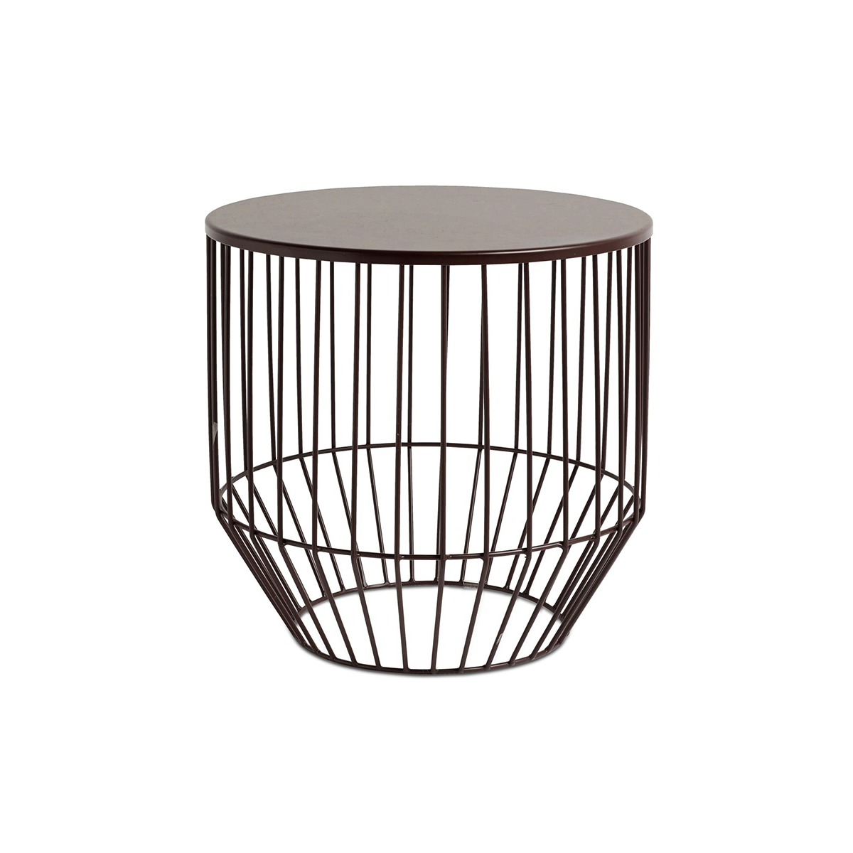
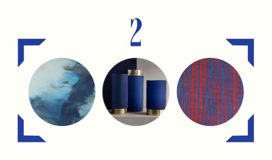
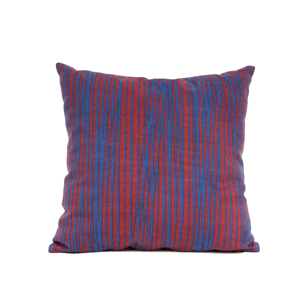
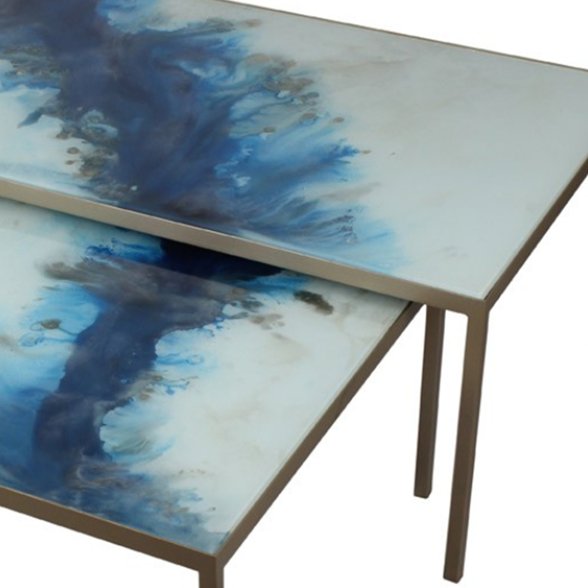
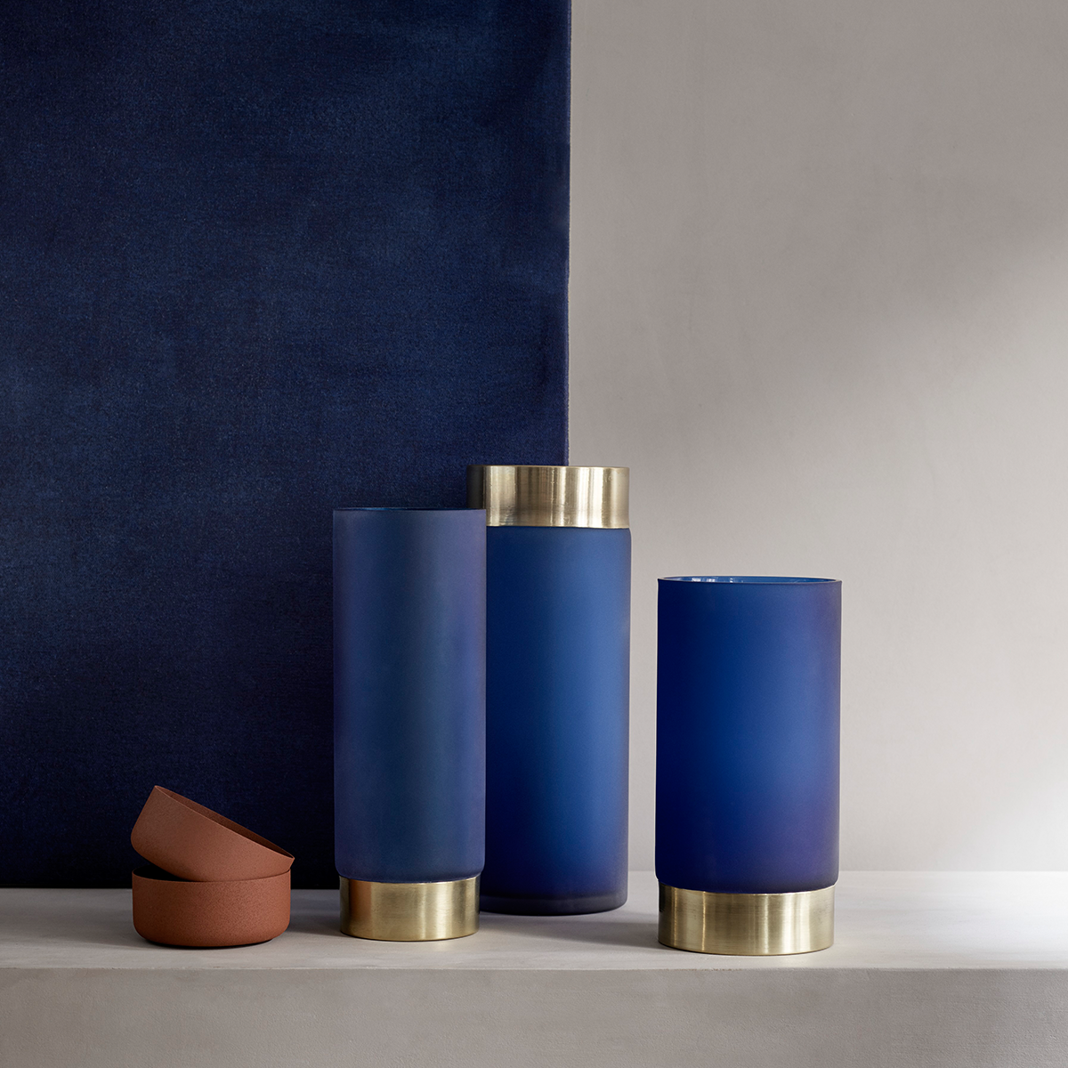
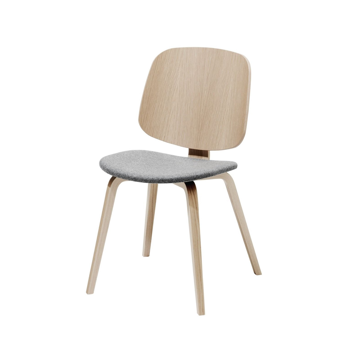
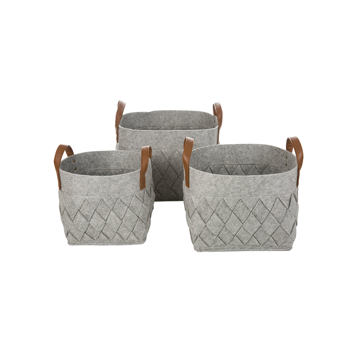
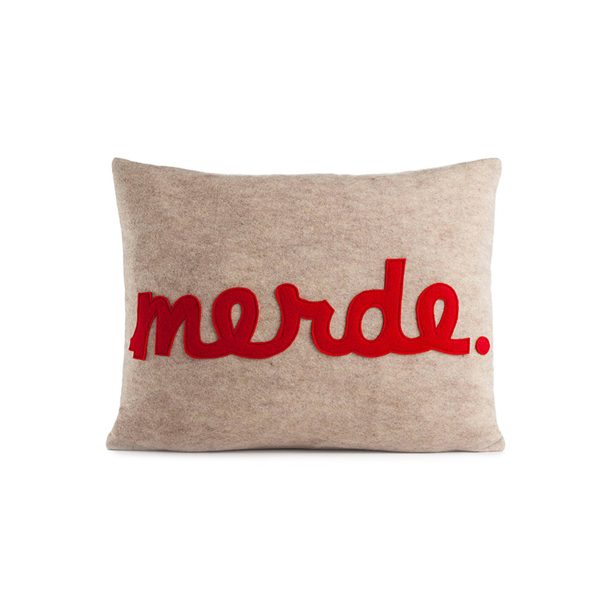
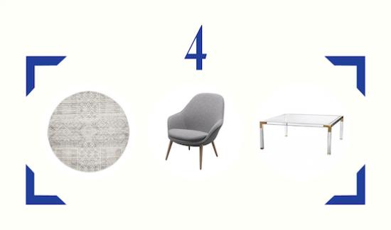
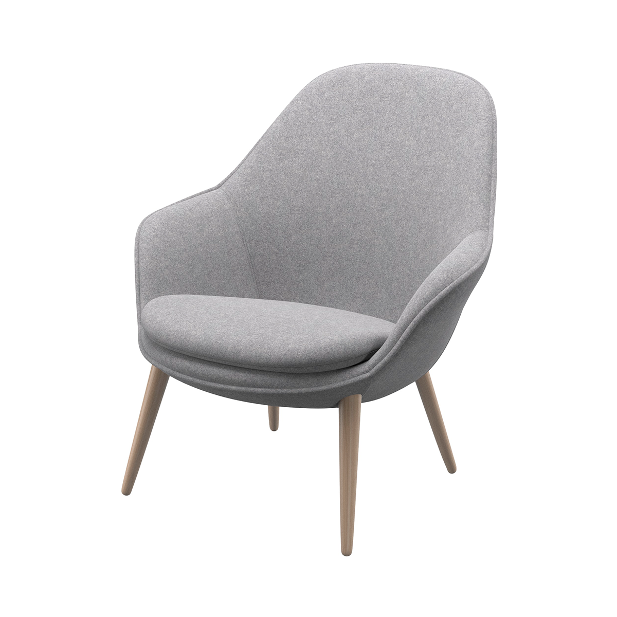
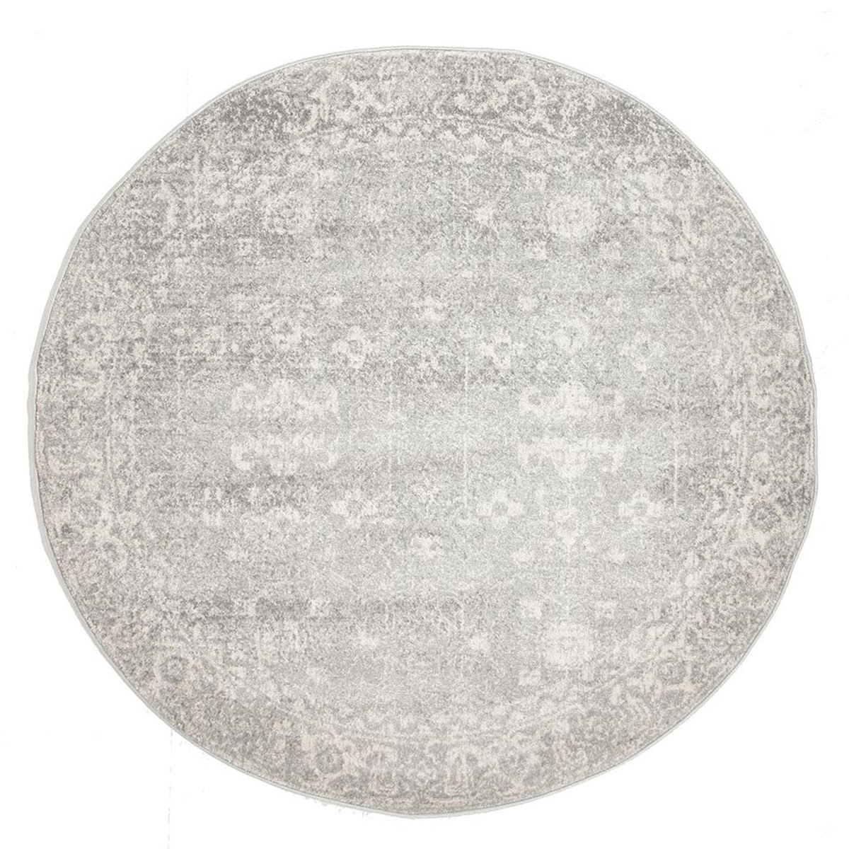
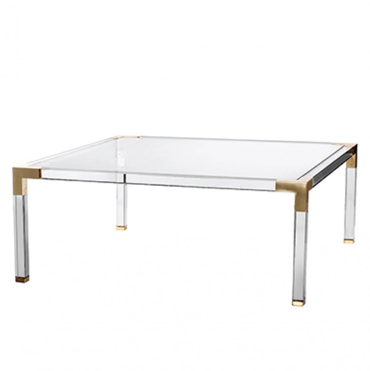
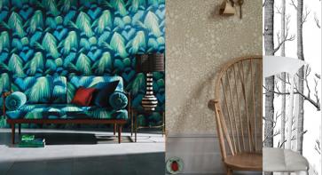
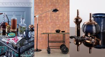
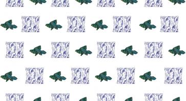
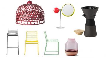
Fashion and the home are running parallel this season, with rich materials and warm, deep hues everywhere. It’s the perfect response to the cooling weather. To help you fire things up at home, we’ve come up with four looks that we love, in partnership with BoConcept. Each of these looks is set to be hot for A/W 2017/2018 and beyond – and they’re timeless enough to last the distance. We’ve also compiled an edit of our favourite items available in store at BoConcept and on the wider web. 

  • 1. HOT HUE #1: BORDEAUX RED

    Hot hue #1: bordeaux red

    You’ve no doubt seen this colour on the catwalks this year, most likely paired with beautiful velvet. Whether you’re looking at rust, burgundy, marsala, carmine or cherry, it’s a rich, warm hue that will add a pop of cosy colour to any space.


    We’d pair it with black and white, or walnut and brass and gold finishes. Or, for a real burst of colour, mix it with petrol blue (our next trend). It’s brilliant for homes in a velvet finish – just like fashion. Think cushions, or a sofa, or BoConcept’s multifunctional Wire, which functions as a stool or a side table. 

  • 2. HOT HUE #2: PETROL BLUE

    Hot hue #2: petrol blue

    This might be one of our favourite colours of all time – it’s versatile and timeless, yet it has an edge to it. It’s considered a greyish-blue, with a touch of green to it. We love it with gold, we love it with walnut or oak, and we love it in velvet. 

  • 3. TACTILE TEXTURES: WOOD AND FELT

    Tactile textures: wood and felt

    This look is similar to soft and sharp, but it’s about materials rather than forms. Juxtaposing opposites can add dimension to your space, and particularly so when you’re mixing materials. Raw, matte wood and soft felt are this season’s hot picks, creating a cosy, Scandinavian vibe that takes things back to basics. Bring in a little marble or stone if you want to add another layer to this look.

  • 4. CONTRASTING FORMS: SOFT AND SHARP

    Contrasting forms: soft and sharp

    Add visual interest with this easy look. Think about combining the clean, strong lines of a bookshelf with curving silhouettes: decorate your shelves with round plates and fluid vases; or pair a square coffee table with a round rug. Here are our picks for how to make this work in your space.


Tags: Design, Scandinavia, Nordic, Home, HK shopping

MORE DESIGN

WALL CANDY

Wall decoration is a highly personal business. Wallpaper can be a backdrop, setting the stage for your furniture and art. Or it can be the piece de...

COCKTAIL HOUR

Whether it’s a fully stocked drinks cabinet with every accoutrement, or a simpler drinks station in one corner of your living room, a home ba...

COOL CUSHIONS & THROWS

As 2016 kicks into action, we’re all keen for a fresh start – for our homes as much as for ourselves. Cushions and throws provide an easy way to give ...

9 SPECIAL INTERIORS SI...

Thanks to these online buying meccas, we’ve got your all your home needs sorted. Here is FLB’s edit of our favourite homewares from the...

10 SEMINAL SCANDI DESI...

Scandinavian design is a failsafe choice for the modern home: it’s accessibly priced, it’s pared-down, it’s functional and it alw...

SECRETS OF A STYLISH H...

Years of working as a design journalist had left Tamsin Bradshaw with a burning desire to create her dream home. Tamsin was editor of Hong Kong int...